
8+15 Best Fonts for Thesis Defense Presentation in 2026

Absolutely everybody loves Calibri as their thesis defense font. People tend to use Cambria, Arial, and Times New Roman too because of their safe readability. But if you want your thesis or dissertation presentation to typographically stand out, there are other beautiful, readable choices like Bricolage Grotesque, Kedebideri, Nan Serif, and Segoe UI. Also, a cautious, very limited use of fonts like Nunito Black, Roboto Thin, and Balzano would enhance the aesthetics of your slides.
This table offers a fast overview of the 8 main fonts discussed in this article, evaluated specifically for thesis defense conditions rather than general design appeal.
Font Academic Risk Level Key Notes
Bricolage Grotesque Low Modern tone with strong hierarchy control
Inter Very low Designed for screen clarity and long reading
Kedebideri Medium Aesthetic character, avoid paragraphs
Nan Serif Medium Serif warmth, use sparingly
Constantia Low One of the most classic academic presentation fonts, stable on projectors
Poppins Medium Geometric look, requires larger sizes
Segoe UI Very low System safe, neutral academic tone
Helvetica Low Familiar and conservative choice
Table of Contents
    Add a header to begin generating the table of contents

    How to Choose the Best Font for a Thesis Presentation?
    Choosing the best font for thesis presentation is fundamentally a risk management decision rather than a stylistic one. The primary goal is to maintain clarity under defense conditions, including long viewing distances, inconsistent projector quality, and time pressure during explanation.
    Best Fonts for Thesis Defense Presentation
    A well-chosen font minimizes visual distraction so the committee can focus on your argument, not your slides. The criteria below help you evaluate your thesis presentation fonts objectively and justify your choice with confidence.
    Criterion What to Check Why It Matters
    Distance legibility Readable from 4–8 meters Committees typically view slides from afar
    Stroke clarity Open counters, moderate weight Prevents blur on low quality projectors
    Academic tone Neutral, non-decorative appearance Signals rigor and seriousness
    Hierarchy support Clear contrast between weights Guides oral explanation and slide flow
    Weight scalability Performs well from Regular to Semibold Avoids excessive bolding or color reliance
    Numeral and symbol clarity Distinct numbers and symbols Essential for data tables, formulas, and references

    Students who want their slides to fully meet academic presentation standards often rely on professional thesis to PowerPoint presentation service to ensure readability, structured content flow, and visual clarity during their defense.

    A simple way to find the best font: Before choosing your final font, you can simply open a blank PowerPoint file. Then add text with different fonts, play with the size, style, and content of each text. Put different versions of a text in one slide, then put it on full-screen, and compare. See which font is performing better before you begin to design your thesis presentation.

    Need help creating a professional PowerPoint presentation?

    8 New Best Fonts for Thesis Defense Presentation That Stunningly Work in 2026

    The following fonts were selected based on real thesis defense conditions. Overall qualities, use cases, and limitations of each are explained.
     
    Note: Obviously, after considering all the technical necessities and rules of the best font for thesis presentation, don’t forget to take into account your taste and feelings too. If you have time, you can create different versions of a presentation with different font combinations. Then practice your defense with each and see what feels better and works for you.

    1. Bricolage Grotesque

    Bricolage Grotesque is a modern humanist sans serif that performs surprisingly well in thesis defense environments when used correctly. Its irregular details add personality without crossing into decorative territory.
    bricolage grotesque font
    Bricolage Grotesque Font
    Why does it work in thesis defenses?
    • Large x height improves legibility at a distance
    • Open counters reduce blur on average projectors
    • Subtle stroke variation creates a clear visual hierarchy
     
    Best use recommendations
    • Section headings and slide titles
    • Key takeaway slides or conceptual frameworks
    • Pair with a neutral body font such as Inter or Segoe UI
     
    Limitations
    • Avoid long paragraphs due to visual texture at small sizes
    • Use Regular or Medium weights for projection safety

    2. Inter

    Inter was designed specifically for screen readability, which makes it one of the best fonts for a thesis defense presentation in terms of safety. The letterforms of this modern font remain stable under projection, compression, and distance viewing, even in text-heavy slides.
    Inter Font.jpg
    Inter Font
    Why does it perform reliably?
    • Very high x height supports long-distance reading
    • Neutral shapes reduce visual fatigue during explanations
    • Excellent numeral and punctuation clarity for data slides
     
    Best use recommendations
    • Primary body text across all slides
    • Supporting headings when consistency is preferred
     
    Limitations
    • A visually conservative thesis presentation font, not ideal if a strong stylistic character is required

    3. Kedebideri

    Kedebideri is a high-contrast display serif with expressive terminals and narrow internal spacing, which makes it unsuitable for sustained reading but effective for controlled emphasis. Its thin hairlines and sharp transitions are sensitive to projector quality and resolution.
    Kedebideri Font
    Kedebideri Font

    Best use recommendations

    • Cover slides or major section dividers
    • Large sizes (42 pt and above) to preserve stroke integrity
     
    Limitations
    • Never use for body text, tables, or data-driven slides
    • Avoid light backgrounds with low contrast

    4. Nan Serif

    Nan Serif is a contemporary serif designed with softened contrasts and generous proportions, which helps it remain readable on screens compared to traditional book serifs. Its letterforms maintain clear vertical stress and open apertures, making it more projector-friendly than high contrast academic serifs.
    Nan Serif Font
    Nan Serif Font
    Why can it work as a thesis defense font
    • Moderate contrast reduces stroke loss under projection
    • Clearly differentiated letter shapes improve word recognition
    • Serif structure makes it one of the most formally acceptable academic presentation fonts
     
    Best use recommendations
    • Section headers and short explanatory blocks
    • Conceptual slides where tone matters more than density
     
    Limitations
    • Not ideal for dense paragraphs or small footnotes
    • Requires careful size control to avoid visual heaviness

    5. Constantia

    Constantia is a transitional serif designed specifically for on-screen reading, which makes it one of the most academically reliable serif choices for thesis defense presentations. Unlike traditional print serifs, its stroke contrast is restrained, and its serifs are open and well-spaced, reducing blur under projection. The font maintains stable letterforms even at smaller sizes, which is critical for methodology, references, and explanatory slides.
    Constantia Font
    Constantia Font
    Why does it work in thesis defenses?
    • Moderate stroke contrast preserves clarity on projectors
    • Wide counters improve slide readability at a distance
    • Strong numeral differentiation supports tables and equations
    Best use recommendations
    • Primary body text for text-heavy slides
    • Methods, results, and reference sections
     
    Limitations
    • Visually conservative, not suitable for expressive headings

    6. Poppins
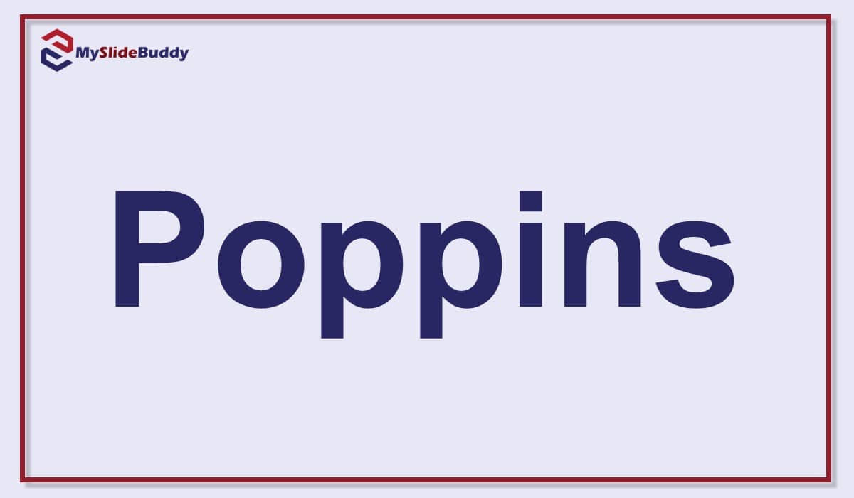
    Poppins is a geometric sans serif with uniform stroke widths and near circular letterforms, which gives it a clean, modern appearance. In thesis defenses, this geometry can both help and hinder slide readability depending on size and context.
    Poppins Font
    Poppins Font
    Best use recommendations
    • Short slide titles and section headers
    • Minimum sizes of 32 pt to avoid character ambiguity
    Limitations
    • Similar letter shapes reduce word recognition at small sizes
    • Not recommended for body text or data-heavy slides

    7. Segoe UI

    Segoe UI is a humanist sans serif optimized for interface and screen readability, which translates exceptionally well to thesis defense presentations. Its proportions are balanced, strokes are consistent, and letterforms remain clear under compression and projection.
    Because it is widely used in academic and enterprise environments, it carries a neutral, low-risk visual tone that examiners subconsciously trust.
    Segoe UI Font
    Segoe UI Font
    Why does it work in thesis defenses
    • High legibility at both large and medium sizes
    • Clear distinction between similar characters and numerals
    • Stable performance on different operating systems and projectors
     
    Best use recommendations
    • Primary body text and secondary headings
    • Data-driven slides, tables, and explanatory content
     
    Limitations
    • Lacks a strong personality for visually expressive titles

    8. Helvetica

    Helvetica is a neo-grotesque sans-serif known for its neutrality and long-standing acceptance in academic and professional contexts. In thesis defense presentations, it functions as a conservative, low-risk option when clarity and familiarity are priorities.
    Helvetica Font
    Helvetica Font
    Best use recommendations
    • Headings and short body text blocks
    • Slides where neutrality is preferred over personality
     
    Limitations
    • Tight spacing can reduce readability at small sizes
    • Less forgiving on low quality projectors without size adjustments

    Want to see what a professionally designed PowerPoint looks like?

    Safest Font Combinations for Thesis Presentation

    The following are some of the most trusted and best PowerPoint font combinations that reflect long-standing academic presentation practices. They are widely accepted, low risk, and familiar to examiners, which makes them especially suitable for thesis defenses where clarity and credibility matter more than stylistic novelty.
     
    So if you want to go for the ultimate safe choice without taking any risks, here’s what we suggest:

    Balanced and clean: Headings, Helvetica | Body, Calibri
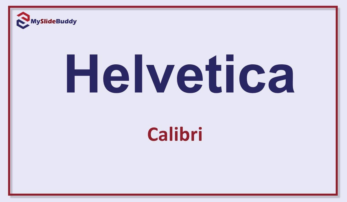
    This pairing prioritizes neutrality and legibility. Helvetica provides strong, confident headings with minimal academic visual design distortion, while Calibri offers smooth, open letterforms that remain readable at a distance. Together, they create a clear font hierarchy in PowerPoint without drawing attention to the typography itself, making them ideal for data-driven or time-constrained defenses.
    Helvetica and Calibri Font Combinations for Thesis Defense Presentation
    Helvetica and Calibri Font Combination

    Traditional academic: Headings, Georgia | Body, Cambria

    The combination of these two academic presentation fonts reflects a classic tone rooted in print traditions. Georgia’s larger x-height and sturdy serifs make headings readable on slides, while Cambria is optimized for sustained reading and formal content. This pairing works particularly well for humanities, law, and theory-heavy research.
    Georgia and Cambria Font Combinations for Thesis Defense Presentation
    Georgia and Cambria Font Combination

    Modern professional: Headings, Segoe UI | Body, Arial or Calibri

    Segoe UI delivers clean, contemporary headings with excellent screen performance. Paired with Arial or Calibri, it creates a modern yet conservative look that feels professional, familiar, and safe for STEM and applied disciplines.
    Segoe UI and Arial or Calibri Font Combinations for Thesis Defense Presentation
    Segoe UI and Arial or Calibri Font Combination

    Beautiful Thesis Defense Fonts That Don’t Compromise Legibility

    Some fonts offer elegant academic visual design without immediately sacrificing slide readability, provided they are used with discipline and clear intent. The following four fonts sit at the intersection of aesthetics and legibility, meaning they can be the best fonts for thesis defense presentation only when applied in limited, controlled contexts such as titles, section dividers, or emphasis slides.

    Nunito Black

    A bold, rounded sans serif that delivers strong academic visual design. Its heavyweight preserves clarity on projectors, making it suitable for short headings or key statements, but never for dense text.

    Raleway

    A refined sans serif with elegant proportions. Readable at large sizes, it works best for title slides or introductory sections where text volume is low.

    Roboto Thin

    Minimalist and sleek, but highly sensitive to projection quality. Legibility is maintained only at very large sizes and high contrast.

    Montserrat Uppercase

    Geometric and structured when set in uppercase. One of the most effective PowerPoint fonts for titles or short labels, but unsuitable for paragraphs or mixed case content.

    Limited-Use Aesthetic Fonts for PowerPoint of Thesis Defense

    Aesthetic fonts can add character and visual distinction to a thesis presentation, but they carry higher risk and must be used with strict discipline. The following aesthetic fonts for PowerPoint do not provide clarity under distance viewing or projector limitations. They should only appear in carefully selected moments such as cover slides, section dividers, or conceptual transition slides.
    • Butler: A high contrast serif with strong editorial character. Suitable as a PowerPoint font for titles only; thin strokes degrade quickly on projectors.
    • Gloock: Elegant and expressive with sharp contrasts. Best reserved for opening slides or thematic separators.
    • Requiem: A refined display serif with historical tone. Visually striking but unsafe for any dense or informational content.
    • Roslindale Display: Bold and authoritative, effective for oversized headings where personality is intentional.
    • Balzano: Experimental and unconventional. Use only for stylistic emphasis, never for academic explanation.
    • Kautiva: Highly decorative and expressive. Appropriate only in visual metaphors or non-textual slides.
    • Yeseva One: Heavy slab-like forms maintain presence at large sizes but feel intrusive if repeated.

    How Projectors Affect Font Readability in Thesis Defense Presentations

    Projectors change typography behavior in ways that are often underestimated by students. Unlike high-resolution screens, most academic projectors introduce optical and technical distortions that directly impact font performance during a thesis defense.
    When choosing the right font for your thesis presentation, have the possible impact of projectors in mind:
    • Edge softening reduces sharp letter boundaries, especially in thin strokes and high contrast serifs.
    • Contrast compression lowers the visible difference between text and background, weakening light weights.
    • Pixel interpolation and scaling blur small details such as terminals and counters.
    • Limited color accuracy alters perceived contrast, particularly with gray or colored text.
    • Viewing distance amplification makes tight spacing and similar letterforms harder to distinguish.
    Thesis presentation fonts with open shapes, moderate weight, and generous spacing remain readable under these constraints, while delicate or decorative fonts degrade quickly.

    Tips for Adjusting Thesis Font Style and Size

    Even the right font can fail if sizing and styling are handled poorly. Fine adjustments significantly improve readability and perceived professionalism during a defense.
    • Use 36–44 pt for slide titles and 24–28 pt for body text
    • Prefer Regular or Medium weights over Light or Thin
    • Increase line spacing to 1.2–1.4× to prevent crowding
    • Avoid full justification; use left aligned text for cleaner edges
    • Test you thesis font style and size on the actual projector or a low resolution simulation
    • Reduce italics and all caps to short, intentional emphasis only

    Final Thoughts and Font Selection Checklist for a Risk-Free Thesis Defense

    Font choice in a thesis defense is about clarity, credibility, and risk control. A safe decision ensures your research remains the focus, not the slides. Before finalizing, confirm that your font is readable at a distance, performs well on a projector, maintains an academic tone, and uses consistent hierarchy. Test slides in real conditions, avoid decorative fonts for core content, and prioritize legibility over visual novelty.
    If you have any doubts or questions about choosing the best fonts for thesis defense presentation, you’re always welcome to use our free consultation services at MySlideBuddy.

    Frequently Asked Questions about Thesis Defense Fonts

    Yes. Helvetica is widely accepted in academic and professional settings due to its neutral tone and familiarity. It is considered low risk, especially for headings and short text blocks.

    Sans serif fonts generally perform better on projected slides due to cleaner shapes and reduced stroke contrast. Serif fonts can still work, but only if they are screen optimized and used at sufficient sizes.

    Thesis presentation fonts should be tested on a projector similar to the defense room setup. View slides from the back of the room, check contrast under different lighting conditions, and verify that numbers, symbols, and smaller text remain legible.

    Yes. Conservative fonts reduce visual risk and help ensure that attention stays on your research. Familiar typefaces are less likely to trigger negative subconscious judgments from examiners.

    All caps can be acceptable for very short headings or labels, but never for paragraphs or bullets. Continuous uppercase text slows reading speed and reduces comprehension at distance.

    Fonts designed for screen readability with neutral tone and moderate stroke weight are safest. These fonts remain clear under projection and do not introduce stylistic distraction.

    Yes, but limit usage to a maximum of two fonts. One should handle body text and the other headings. Additional fonts increase cognitive load and visual inconsistency.

    Prices start from $3.99 per slide

    Scroll to Top