
Yes, stuffing your slides with text is bad; but that’s not the whole story. A deck filled with text could be actually acceptable, and even essential for 5-10% of presentation files. If you’re curious why, some 20 mind-blowing pros and cons of text-heavy slides will be explained here. Easy content search, independency of the speaker, fast & cheap production, and legal alignment are only some of the less-noticed advantages.

What Are Text-Heavy Slides?
Text-heavy slides are presentation slides where written content dominates visual elements; often in the form of dense bullet lists, full sentences, or paragraphs. They function more like documents than visual aids. Unlike visual-first decks designed to support spoken delivery, text-oriented slides should aim to convey complete information independently, without requiring a presenter.
Typically, they contain 60–120+ words, 6–12 lines of text, minimal whitespace, and limited visual hierarchy.
The Bottom Line Up Front: Text-Heavy Slides Fail 90% of the Time
Slides with crammed text often fail to engage the audience, and hinder message retention. Overloading PowerPoint slides with text creates cognitive overload, making it difficult for people to process and remember key points.
In most cases, less is more. Effective presentation design should rely on visuals and concise text to keep the audience focused. Overcomplicating a slide with too much information usually leads to disengagement and confusion.
Pros and Cons of Text-Heavy Slides
While text-heavy slides can be useful in specific situations, they come with serious drawbacks. Below is a quick comparison of only the most central benefits and challenges of these kinds of presentation slides.
| Pros | Cons |
|---|---|
| Works well without the speaker | Can cause cognitive overload |
| Reduces misinterpretation | Weakens emotional and persuasive impact |
| Easy to search, index, and reuse | Makes the presenter redundant |
| Faster to produce | Low memorability |
| Precise language for technical details | Reduces flexibility in strategic discussions |
| Legal and compliance alignment | Visually unappealing and overwhelming |
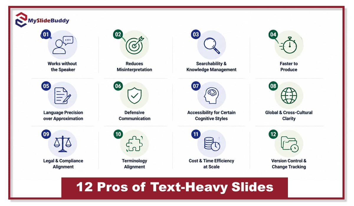
12 Pros of Text-Heavy Slides
Wordy slides are widely criticized; often deservedly. Yet in specific strategic contexts, they outperform visual-first decks. When precision, documentation, scalability, or legal defensibility matter more than persuasion, density becomes a feature, not a flaw.
1. Works without the Speaker
Text-heavy slides can function independently when presentations are emailed, printed, or reviewed asynchronously. In these cases, slide clarity must survive without narration.
In distributed teams and executive workflows, PowerPoint slides are often skimmed without context. A self-contained slide preserves meaning without relying on tone or delivery. This reduces follow-up clarification and ensures alignment when decisions are made offline. In documentation-driven environments, such standalone quality is not only not a flaw, but also a strategic advantage.
2. Reduces Misinterpretation
Text-saturated slides reduce ambiguity by anchoring ideas in explicit language rather than suggestive visuals. When precision matters, written wording limits subjective interpretation and protects intent.
Clear text pins meaning down by:
- Defining key terms explicitly
- Stating assumptions instead of implying them
- Clarifying scope and boundaries
- Reducing emotional over-interpretation from visuals
3. Searchability & Knowledge Management
Text-heavy slides are easily searchable and can be indexed, offering long-term value for knowledge management. Unlike visuals, text is immediately extractable and reusable across documents and platforms.
Key benefits include:
- Full-text searchability
- Easy information extraction for reports
- Reusability in templates
- Integration with document management systems
- Efficient updates
- Improved version control
Note: Moreover, your PowerPoint slides will be machine-readable and work perfectly with AI systems of information management, which are becoming common exponentially these days. Text preserves institutional history more rigorously than graphics.
4. Faster to Produce
This is obvious, but it still feels necessary to bring up. In certain contexts, text-heavy decks are quicker to create than designing complex visuals. For internal reports, status updates, or technical briefings, writing clear text can be faster than developing custom graphics, diagrams, or animations; especially under tight deadlines.
5. Language Precision over Approximation
PPT files with high textual density allow for the accurate expression of complex concepts that might be hard to represent visually. Legal thresholds, statistical conditions, and procedural constraints, for example, often require precise language that avoids ambiguity.
While visuals can simplify or generalize, text ensures that these nuances are clearly defined. Such a feature may be considered among both pros and cons of text-heavy slides, but in certain circumstances, it is definitely a plus.
6. Defensive Communication
A text-centric deck provides a layer of protection against misquotation or misinterpretation. Written slide content strengthens the clarity of intent, ensuring key points are documented.
Such a slide:
- Minimizes ambiguity in complex discussions
- Enhances credibility
- Serves as a reference point
- Protects against oversimplification
7. Accessibility for Certain Cognitive Styles
Not all audiences process information visually. Some individuals comprehend and retain ideas more effectively through structured reading rather than diagrams or imagery.
For analytical thinkers, text enables re-reading, note-taking, and deeper cognitive processing. It allows precise comparison of terms, conditions, and data points.
8. Global & Cross-Cultural Clarity
Visual metaphors, while powerful, can easily be misinterpreted across cultures. What works as an inspiring symbol in one region may confuse or offend in another. Text-heavy slides, however, offer a universal language that transcends cultural boundaries, provided the language is clear and concise. Well-written text ensures that the message is understood by a global audience, making it easier to communicate complex ideas across different departments, industries, and cultural contexts without the risk of miscommunication.
9. Legal & Compliance Alignment
In regulated industries, text-heavy decks are invaluable for meeting legal and compliance requirements. Textual content provides a clear, auditable trail, ensuring that all assertions, thresholds, and procedures are documented, leaving minimal room for legal challenge.
10. Terminology Alignment
Text-dense slides enforce consistent terminology, crucial for ensuring precision in technical, scientific, or legal contexts. By clearly defining terms and ensuring uniformity, they prevent miscommunication and semantic discrepancies that could lead to costly misunderstandings or operational inefficiencies.
11. Cost & Time Efficiency at Scale
In large organizations, producing numerous presentations can be resource-intensive. Text-heavy slides, however, offer significant cost and time efficiencies, especially when scaling content across multiple teams. By standardizing slide content through text, teams can repurpose Google or PowerPoint slides, update them quickly, and automate parts of the process without needing extensive graphic design input.
12. Version Control & Change Tracking
Text-heavy decks excel in environments that require rigorous version control. Text-based content is easy to track, compare, and modify, enabling seamless collaboration and iterative improvements. Change tracking ensures that updates are transparent and can be efficiently audited across teams.
8 Cons of Text-Heavy Slides
While having a high volume of text on your deck can be beneficial in certain contexts, they come with significant downsides. From cognitive overload to reduced persuasion, such an approach often hinders audience engagement, retention, and the speaker’s effectiveness. Let us explore why less might truly be more.

1. Cognitive Overload
Using too much text for slide content can overwhelm cognitive processing, particularly when audiences are required to read while listening. This dual-task interference impairs attention, reduces retention, and strains working memory capacity, a phenomenon supported by cognitive load theory.
As text density increases, the brain must expend more cognitive resources, leading to diminished ability to process both verbal and written information simultaneously.
2. Poor for Persuasion
Text-packed slides can inform; but persuasion operates differently. Influence depends on contrast, pacing, and emotional activation. Dense text suppresses narrative momentum and reduces cognitive salience, making arguments feel technical rather than compelling.
They typically weaken persuasion because:
- Emotion is diluted by excessive explanation
- Visual contrast and tension disappear
- Key messages lose memorability and impact
3. Audience Reads Ahead and Presenter Becomes Redundant
When every sentence is already on the slide, the presenter quietly disappears. The audience reads ahead, forms conclusions, and disengages from the speaker. Your audience will be already three points ahead, planning their grocery list while you’re still explaining bullet number one!
Authority shifts from the person to the paragraph. Instead of guiding insight, the presenter becomes a voice-over for text everyone can already see, which is rarely a powerful role.
4. Low Memorability
Research in cognitive psychology reveals that people retain images and stories far better than text. Dense textual information does little to engage the brain’s visual processing systems. The result? A dramatic drop in memorability.
When information is presented visually or through narrative, it triggers emotional responses and activates deeper neural pathways, enhancing long-term retention. Dense text lacks these qualities, often fading from memory as soon as the slide changes. Thus, the cognitive load required to process text-heavy slides becomes a barrier to both immediate and long-term recall.
5. Signals Lack of Confidence
When the presentation screen is overloaded with text, it often gives the impression that the speaker isn’t confident enough to convey their message concisely. Instead of trusting the audience to follow, the presenter clings to excessive words, fearing the message won’t land. The message gets buried under unnecessary explanation, and the speaker’s authority diminishes.
6. Reduces Strategic Ambiguity
If you want to eliminate flexibility, lock down every detail and restricting room for interpretation, then sure, go for excessive text in your PPT file. In strategic discussions or negotiations, leaving space for ambiguity allows for adaptive responses and preserves options, crucial for success in dynamic environments.
Key drawbacks include:
- Restricts creative problem-solving
- Limits negotiating flexibility
- Reduces cognitive adaptability
- Hinders real-time decision-making
7. Visually Unforgiving
Text-heavy slides are like a messy room: everything’s there, but nothing looks good. The more you cram in, the harder it is to find anything worth paying attention to!
8. Scales Poorly to Large Rooms
A deck replete with text faces serious visibility issues in large settings. As text size decreases to fit dense content, legibility suffers, especially in expansive rooms with poor sightlines. Human visual processing can’t effectively parse small text from a distance, diminishing audience engagement and reducing the clarity of key points. This undermines the impact of presentation design, particularly for large-scale events.
The 3 Golden Rules of Slide Text Density
Don’t know how to adjust text density in your presentation design? Here are the top 3 important rules that can immediately help.

1. One Cognitive Job per Slide
Each slide should focus on one task: reading, listening, or visual processing. The concepts introduced or explained should also be limited, interrelated and focused. Trying to combine too many functions and ideas (like overwhelming text and complex visuals) can overload the audience’s cognitive capacity. Keep it simple.
2. Match Text Density to Time Control
Text density must align with the pacing control to optimize cognitive processing. In self-paced environments, such as printed or asynchronous decks, higher text density is acceptable, as the audience has time to process and revisit slide content. This allows for deeper information delivery without overwhelming cognitive resources.
In live presentations, where time control is limited, dense text disrupts cognitive flow. The brain’s dual-channel processing system, which handles both visual and auditory input, can only manage limited information at once. Therefore, text density must be reduced in live settings to ensure clarity, prevent cognitive overload, and maintain audience focus.
3. Separate Narrative Slides from Record Slides
Narrative slides and record slides serve distinct purposes and should be treated accordingly.
Narrative slides must focus on clarity and emotional resonance, using minimal text and compelling visuals. In contrast, record slides (meant for documentation) can contain detailed, dense text, serving as a reference rather than a primary communication tool.
Conclusion
While text-heavy slides often face criticism, they have undeniable advantages in specific contexts. A textually detailed deck can improve retention by up to 20% in technical fields, even though they decrease audience engagement by 60%. Ultimately, the key is balance: weigh up the pros and cons of text-heavy slides for your own specific use case; use text strategically when precision is needed, but ensure it complements visuals to keep your audience engaged.
If you have an excessively text-heavy PowerPoint presentation and need a professional redesign, MySlideBuddy is always glad to help! All you need to do is to visit our services page.
Frequently Asked Questions about Text-Heavy Slides
These sorts of presentations are especially useful for providing detailed information, explaining complex concepts, and ensuring the audience has a clear understanding of the key points. Text also serves as a reference for later review and for searchability and documentation.
A good rule of thumb is to limit the maximum amount of text up to approximately 50 words per slide. Strive to keep slide content concise and focused, emphasizing key points and avoiding long paragraphs. Short, impactful statements with bullet points tend to work best.
Cultural differences can influence how information is perceived. Text-heavy slides may be effective in cultures that value thorough documentation, but in visual-centric cultures, excessive text could hinder audience engagement and comprehension.
To prevent overwhelming the audience, consider breaking the information into smaller, digestible sections across multiple slides. Use clear headings, subheadings, and bullet points to structure the content. Ensure adequate spacing.
Yes, they are often more effective in industries where detailed information, precision, and documentation are critical. Fields like law, finance, medicine, and engineering benefit from text-dominant PowerPoint slides that provide clear, unambiguous explanations. In these industries, text serves as a reliable source of reference for regulations, technical specifications, and complex data.
To reduce text while maintaining slide clarity, focus on summarizing key points rather than including every detail. Use visuals like charts, graphs, or icons to represent complex information visually.
Explore More from MySlideBuddy Blog
Need a better PowerPoint presentation? We can help