
A literature review is often the densest part of a dissertation or research presentation. Dozens of studies, competing theories and years of findings get compressed into pages of prose. When you then have to present that work on slides, the audience sees a wall of text and switches off.
The good news is that a literature review already has a story inside it. There is a starting point, a sequence of developments, tensions between camps of researchers, and a gap that your own work fills.
Turning that into visuals is not decoration. It is a way of making the argument easier to follow.
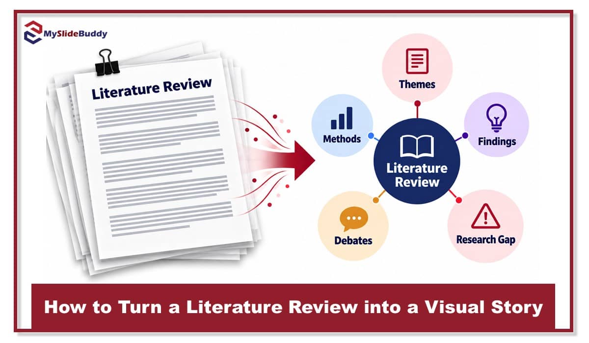
This guide walks through a practical method for converting a written review into a visual narrative, with formats you can reuse, a worked example, and the mistakes to avoid.
Start with the argument, not the slides
Before you open any design tool, get clear on what your review actually argues. Most literature reviews follow one of a few underlying shapes. Recognising yours tells you which visual format will carry it best.
A chronological review shows how thinking evolved over time. A thematic review groups studies by topic or concept. A methodological review contrasts how different researchers approached the same question. A gap-focused review builds towards a hole in the evidence that your study addresses.
If your written review is not yet organised around one of these shapes, fix that first. A well structured review is far easier to visualise, and a good primer on how to write a dissertation literature review will help you settle the structure before you start designing.
“If you cannot say in one sentence what your review argues, no diagram will say it for you.”
Match the visual format to the shape of your review
Each review shape has a natural visual counterpart. Choosing the right one does most of the work for you. The table below summarises the main options and when each earns its place on a slide.
| Review shape | Best visual format | What it shows at a glance | Watch out for |
|---|---|---|---|
| Chronological | Timeline | How ideas developed and which studies were turning points | Cramming every study in; keep only the milestones |
| Thematic | Concept map or cluster diagram | The main themes and how they connect or overlap | Too many nodes; aim for five to seven themes |
| Methodological | Comparison matrix | Which methods, samples and measures each study used | Tiny text; split a large matrix across two slides |
| Gap-focused | Funnel or gap diagram | Broad field narrowing to the specific unanswered question | Overselling the gap; be honest about nearby studies |
| Systematic | PRISMA flow diagram | How many records were found, screened and included | Missing numbers at each stage; follow the standard layout |
For systematic reviews in particular, the flow diagram is not optional. The PRISMA statement provides the standard template that examiners and journal reviewers expect, and using it signals that your search was rigorous.
A worked example: from thematic prose to a concept map
Suppose a student is reviewing research on remote working and employee wellbeing. Their written review runs to nine pages and cites forty studies. On a slide, that is unpresentable as text. Here is how it converts.
First, they list the themes their review already discusses: work life boundaries, social isolation, autonomy, managerial trust, and digital fatigue. Five themes, which is a comfortable number for one diagram.
Second, they place “employee wellbeing” at the centre and arrange the five themes around it. Each theme becomes a node, labelled in three words or fewer.
Third, they draw links only where the literature shows a relationship. Autonomy connects to managerial trust because several studies find they rise together. Social isolation connects to digital fatigue for the same reason. Where studies disagree, they mark the link with a dashed line and a small question mark.
Finally, they annotate each node with two or three key author names and years. The forty studies are still represented, but the audience now sees the structure of the field in a single glance.

The written review has not changed. What has changed is that the presenter can now walk the audience through the field one node at a time, in the order the argument needs.
Design principles that keep the story readable
A visual literature review fails for the same reason a written one does: too much, too fast. A few principles keep it under control.
One idea per slide. If your timeline has twelve milestones, show three per slide and build it up. Audiences cannot absorb a finished diagram and your commentary at the same time.
Use colour to mean something. Assign one colour to each theme, or to each research camp, and keep it consistent across every slide. Colour should carry information, not just look pleasant.
Label with authors, not citations. “Smith 2021” on a node is readable. A full reference is not. Keep the complete references in your notes or a final slide.
Show the gap explicitly. Whatever format you use, make sure the audience can point to the space your study fills. A greyed out or dotted region on the diagram works well for this.
“A good visual review lets the audience predict your research question before you say it out loud.”
Build the visuals from a clean evidence base
The quality of any diagram depends on how well organised the underlying sources are. If your references live in scattered documents, you will struggle to see the patterns worth drawing.
A reference manager such as Zotero lets you tag every source by theme, method and year. Once tagged, the clusters and timelines almost draw themselves, because you can filter the library and see which studies belong together.
University writing centres also publish useful frameworks for organising the review before you visualise it. The USC guide to literature reviews is a clear reference for deciding between chronological, thematic and methodological structures.

Common mistakes and how to avoid them
The most frequent error is treating the visual as a summary of everything. A diagram that includes all forty studies is a list, not a story. Be ruthless about which sources appear on the slide and keep the rest in your speaking notes.
The second is inconsistency. If a theme is green on slide four and blue on slide seven, the audience loses the thread. Decide your colour and shape conventions once and apply them everywhere.
The third is presenting the diagram fully formed. Reveal it in stages so that each element arrives with the sentence that explains it. This is where slide software earns its keep, because build animations do exactly this job.
The last is forgetting the gap. A visual literature review that does not end by pointing at your research question has told the setup without the payoff.
A simple workflow you can reuse
Here is the full process in five steps, which works for a dissertation defence, a conference talk or a research proposal presentation.
One, write or tidy the review so it follows a single clear shape. Two, tag your sources by theme, method and year. Three, pick the visual format that matches the shape, using the table above.
Four, draft the diagram with no more than seven main elements and label with author names. Five, plan the reveal so each element appears with its explanation, and finish on the gap.
Done this way, the literature review stops being the slide the audience dreads and becomes the moment they understand why your research matters.

Final thoughts
Your written literature review already contains a narrative: how a field developed, where it agrees and disagrees, and what it has not yet answered. Visualising it simply makes that narrative visible.
Choose the format that fits the shape of your argument, keep the elements few and the colours meaningful, and let the gap be the last thing on the screen.
Transform Your Literature Review Into a Professional Presentation