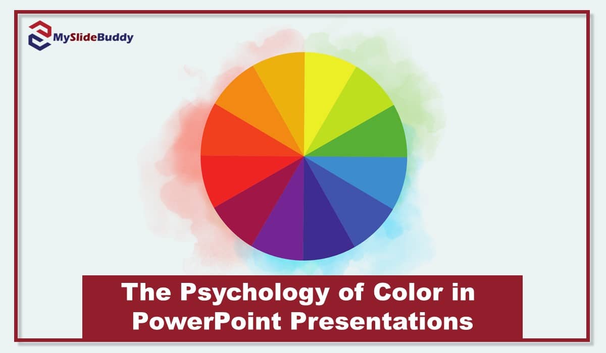
The psychology of color in PowerPoint presentations plays a key role in how your audience feels, what they focus on, and how well they remember your message. Even if you do not read the full article, here is one thing to remember. Choose two or three colors that reflect the mood of your topic, make sure there is enough contrast between text and background, and avoid colors that distract from your content. In this article, we explore what different colors communicate, how to choose a color scheme that fits your message and audience, and which color combinations work best for different types of presentations.
What Is Color Psychology?
Color psychology is the study of how colors affect the way people feel, think, and respond. It is something we experience in everyday life. For example, red often feels urgent, blue tends to feel calm and dependable, and green brings a sense of balance. These reactions are not just personal preferences. They come from how our brains are wired to interpret visual signals.
When it comes to PowerPoint presentations, color psychology is about using these natural reactions to make your message more effective. The right color choices can help you highlight important points, keep your audience focused, and create a specific mood that supports your topic.
We have seen this in action many times at MySlideBuddy. For instance, we once redesigned a thesis presentation for a graduate student who had used bright neon colors throughout. The content was excellent, but the colors were overwhelming. After switching to a more grounded palette with soft blues and charcoal accents, the presentation felt more professional and easier to follow. The student later told us that even the professor commented on how much more confident and focused the final version looked.
Common Colors and Their Psychological Impact
Each color carries emotional weight. When used intentionally in a PowerPoint presentation, color can shape the tone of your message and influence how your audience feels and remembers the content. Here is a look at the most common colors and the psychological responses they tend to trigger.
| Color | Emotional Meaning | Best Used For | Avoid When... |
|---|---|---|---|
| Blue | Trust, calm, professionalism | Business, academic slides | The topic needs high energy |
| Red | Passion, urgency, attention | Warnings, emphasis, marketing | Overused in data-heavy slides |
| Green | Balance, nature, growth | Health, finance, environmental | You need a very formal or serious tone |
| Yellow | Optimism, creativity, warmth | Callouts, new sections | Used as body text or background |
| Black | Power, luxury, seriousness | Formal business, design-focused | Without strong contrast or readability |
Blue
Often associated with trust, calm, and intelligence. Blue is a favorite for academic and business presentations because it helps create a sense of stability and professionalism. We use it frequently when clients want to appear credible and composed.
Red
Represents energy, urgency, and passion. It grabs attention quickly and is ideal for emphasizing a strong message. However, too much red can feel aggressive or stressful, so it should be used in moderation.
Green
Symbolizes balance, growth, and health. It works well in presentations about environment, wellness, or finance. Audiences often find green refreshing and easy on the eyes during longer sessions.
Yellow
Linked to optimism and creativity. A small touch of yellow can brighten a slide and guide the viewer’s attention. We often use it to highlight callouts or introduce new sections, but we avoid using it for text because it can reduce readability.
Black
Communicates sophistication and power. It is commonly used in high-impact business or design-focused slides. Black backgrounds can look sleek but need strong contrast to stay readable.
Gray
Neutral and balanced. Gray is a safe choice for backgrounds or secondary elements. It supports other colors well and prevents distraction, especially when the focus should stay on the content.
White
Clean, simple, and open. White space helps reduce visual clutter and gives the content room to breathe. It is a core part of minimalist designs and keeps the slides from feeling crowded.
Orange
A mix of red’s energy and yellow’s optimism. Orange feels friendly, enthusiastic, and confident. It works well in slides meant to motivate or energize. We sometimes use it in student presentations where the goal is to keep the audience engaged without feeling too intense.
Purple
Often connected to creativity, imagination, and wisdom. Purple brings a sense of depth and can work well for topics that explore abstract or visionary ideas. We have used it in psychology and marketing presentations where the content touches on innovation or emotional insight.
Pink
Associated with empathy, care, and softness. Light pink tones can be great for topics related to well-being, mental health, or personal development. We usually avoid bright pinks for professional settings unless they match the brand or purpose.
Brown
Natural, grounded, and dependable. Brown gives off a sense of warmth and stability. It is less common in digital presentations but can work well for topics related to nature, history, or tradition. We have used it for environmental science and cultural studies projects.
Gold
Symbolizes success, luxury, and value. Gold can add a subtle touch of elegance when used sparingly. We often include it in celebratory or award-related slides, especially in graduation or corporate recognition events.
Choosing a color is never just a visual decision. Each shade creates a feeling, whether you realize it or not. Over the years, we have found that being mindful of these subtle effects can be the difference between a forgettable presentation and one that sticks.
Not sure which colors to use in your presentation? Let our experts take care of it.
How to Choose the Right Color Scheme for Your PowerPoint
Choosing the right color scheme is not just about what looks good. It is about finding a visual tone that supports your message, fits your audience, and matches the setting where you will present. A well-chosen color palette helps guide attention, build trust, and keep your content easy to follow.
Here are some practical steps we recommend, based on what we have learned from designing hundreds of presentations for students, researchers, and professionals.
1- Start with your topic
Ask yourself what kind of message you are trying to deliver. Is it formal or casual? Analytical or emotional? A research defense might call for cooler tones like navy or gray, while a creative pitch could benefit from bold colors like orange or teal.
2- Consider your audience
Think about who will be watching. For academic or business settings, stick to clean, professional colors with high contrast. For younger audiences or creative fields, you can be a bit more playful and expressive with your choices.
3- Use no more than three primary colors
Too many colors can overwhelm and distract. We usually recommend choosing one main color, one accent color for emphasis, and a neutral background. This keeps the design clean and the message clear.
4- Check for contrast and readability
Good contrast between text and background is essential. Dark text on a light background or light text on a dark background usually works best. We always test slides on different screens to make sure they remain readable under different lighting conditions.
5- Test the emotional tone
Look at your slides and ask what feeling they create. Does it match your content? If you are talking about health, green might work better than red. If your topic is about risk or urgency, red could help emphasize the stakes.
6- Stay consistent
Once you choose a color scheme, stick with it throughout the presentation. Inconsistent colors can make a presentation feel unprofessional or confusing. Most templates we design at MySlideBuddy use a consistent color palette tied to the topic and flow of the content.
Choosing a color scheme is not a one-size-fits-all decision. But if you follow these steps, you can make thoughtful choices that improve how your message is received and remembered.
Understanding Basic Color Harmonies
Choosing the right colors is not just about picking your favorite shades. It is also about how those colors work together. One simple way to build a strong palette is to use basic color harmonies. Complementary colors, like blue and orange, create high contrast and energy. Analogous colors, such as blue, teal, and green, offer a softer, more unified look. Monochromatic palettes, built from different shades of a single color, feel clean and professional. Using these principles can help you create slides that feel balanced and intentional, rather than random or distracting.
Best Color Combinations for Different Types of Presentations
Not every presentation is the same, and neither should its color scheme be. Over time, we have learned that choosing colors based on the type of presentation makes a real difference in how the message lands. Below are color combinations that we have seen work well across different settings.
Academic Presentations
These presentations require clarity, structure, and professionalism. You want your slides to feel serious but still visually engaging.
- Primary Color: Navy Blue
- Accent Color: Light Gray or Teal
- Background: White or Off-White
This combination supports focus and makes data-heavy slides easier to process.
Read More: 12 PowerPoint Presentation Tips for Students
Business Presentations
Here the goal is often to communicate strategy, performance, or leadership. A sharp and modern color scheme sends the right message.
- Primary Color: Charcoal or Dark Blue
- Accent Color: Gold or Deep Red
- Background: Light Gray
We use this setup often for client proposals and corporate decks because it balances authority with a touch of energy.
Creative or Marketing Presentations
For projects that aim to inspire or sell an idea, you have more room to be expressive. The right colors can spark curiosity and excitement.
- Primary Color: Coral or Orange
- Accent Color: Aqua Blue or Soft Purple
- Background: Light Beige or White
This palette works well in pitches, portfolio showcases, and design briefs.
Technical or Scientific Presentations
You want slides that look clean and intelligent. Here, readability and visual logic matter most.
- Primary Color: Steel Blue or Green
- Accent Color: Yellow or Light Cyan
- Background: White
This contrast keeps attention on graphs, data, and key findings without distracting the viewer.
Health and Wellness Presentations
Tone and emotion matter here. Soothing colors help create a sense of calm, empathy, and balance.
- Primary Color: Soft Green or Light Blue
- Accent Color: Lavender or Beige
- Background: White
We often recommend this scheme for presentations in psychology, nursing, or public health topics.
There is no single perfect color combo, but these tested palettes give you a strong starting point. The more your colors align with your topic and tone, the more connected your audience will feel throughout the presentation.
Aligning with Brand Colors and Current Trends
If you are designing a presentation for a brand or business, begin with the official brand colors. These colors already carry recognition and emotional meaning for your audience. From there, you can build a clean and readable palette by adding neutral tones or a subtle accent that supports the overall mood. In creative or marketing-focused presentations, including a modern color inspired by current design trends can make your slides feel more up to date. Just be sure that every color still enhances your message and maintains strong contrast for readability.
Ready to make your slides more engaging and effective with the right color strategy?
Why the Psychology of Color in PowerPoint Presentations Matters
Understanding the psychology of color in PowerPoint presentations allows you to move beyond surface-level design and start using color as a strategic communication tool. The right colors can shape how your audience feels, what they focus on, and how well they remember your message. Whether you are preparing a thesis, a business pitch, or a creative showcase, thoughtful color choices make a real difference. If you are looking for professional powerpoint presentation services, our team at MySlideBuddy is here to help.
Sources
Frequently Asked Questions About the Psychology of Color in PowerPoint Presentations
Navy blue, charcoal gray, and white are safe and professional choices. They create a sense of trust, clarity, and seriousness without distracting the audience.
We recommend using one primary color, one accent color, and a neutral background. Three is usually enough to keep the design clean and focused.
Yes. Research shows that color can enhance memory retention by improving focus and emotional engagement. Warm colors grab attention quickly, while cool colors help with comprehension.
Not necessarily. Business presentations may benefit from formal tones, while creative or marketing slides can use brighter, more expressive colors. Your audience and topic should guide your palette.
Avoid low-contrast combinations like yellow on white or red on black. Also, overusing neon or saturated colors can make your slides look unprofessional or overwhelming.
Think about the tone of your content. For calm, reflective topics, use cool colors like blue or green. For high-energy or emotional topics, warmer tones like red or orange may work better.
High contrast between text and background helps readability and focus. Color psychology isn’t just about emotion, it is also about making sure your message can be easily seen and understood.
Absolutely. Start with your brand colors as a base, then adjust contrast and add neutral support colors to maintain clarity.
Prices start from $3.99 per slide